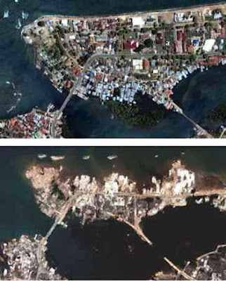
 Bandar Acheh: Before & After Tsunami
Presentation Mistake #1 - You Don't Know Your Topic!
You memorized the content. Someone has a question. Panic sets in. You never prepared for questions and all you know about this topic is what is written on the slides.
A better scenario: Know your material so well, Be prepared for questions and know the answers.
Presentation Mistake #2 - The Slides Are Not Your Presentation
Each of your slides in filled with the text of your speech. Why do they need you in front?
A better scenario : Always remember that you are the presentation. The slide show should only be used as an accompaniment to your talk. Simplify the content. Speak to the audience, not to the screen.
Presentation Mistake #3 - Too Much Information
You know so much about the topic, that you jump from here to there and back again talking about everything, and no one can follow the thread of the presentation.
A better scenario : Use the K.I.S.S. principle (Keep It Silly Simple) when designing a presentation. Stick to three, or at the most, four points about your topic and give further details about them.
Presentation Mistake #4 - Poorly Chosen Design or Theme
You heard blue was a good color for a design template or design theme, with a beach scene. Water is blue, right? Unfortunately, your presentation is about some effective new tools.
A better scenario
Choose a design that is appropriate for the audience. A clean, straightforward layout is best for project presentations.
Presentation Mistake #5 - Electrifying Color Choices
Audiences don't like unusual color combinations. Some are unsettling and red and green combos can't be differentiated by those with color blindness.
A better scenario
Good contrast with the background is essential to make your text easy to read. Dark text on a light background is best. Off white or light beige is easier on the eyes than the typical white. Dark backgrounds are very effective, if the text is light for easy reading. Patterned or textured backgrounds make text hard to read.
Presentation Mistake #6 - Poor Font Choices
Small, script type fonts might look great when you are sitting 18 inches away from the monitor. You didn't consider the audience sitting 50 feet away from the screen who can't read them.
A better scenario : Stick to easy to read fonts such as Arial or Times New Roman. Use no more than two different fonts – one for headings, another for content and no less than a 30 pt font so that people at the back of the room can read them easily.
Presentation Mistake #7 - Extraneous Photos and Graphs
You figured no one will notice that you didn't do much research on your topic if you add lots of photos and complicated looking graphs.
A better scenario : Use photos, charts and diagrams only to emphasize key points of your presentation. Illustrate, don't decorate.
Presentation Mistake #8 - Too Many Slides
Your vacation cruise was so fantastic that you took 200 photos, and put them all in a digital photo album to impress your friends. After the first 50 slides, snores were heard in the room.
A better scenario : Ensure your audience stays focused by keeping the number of slides to a minimum. 20 to 30 is plenty. Be kind though. Think how much you enjoy everyone else’s vacation pictures!
Presentation Mistake #9 - Different Animations on Every Slide
You found all the really cool animations and sounds and used 85% of them in your presentation, to impress everyone with your flair. The audience doesn’t know where to look, and have totally lost the message of your presentation.
A better scenario : Animations and sounds, used well, can heighten interest, but don't distract the audience with too much of a good thing. Don't let your audience suffer from animation overload.
Presentation Mistake #10 - Hardware Malfunctions
The audience is settled. You are all set to start your presentation and - guess what? The computer doesn't work. You didn’t bother to check it out earlier.
A better scenario : Check all the equipment and rehearse your presentation,
we try our best to improve our slide n presentation
ReplyDeleteOK..All the best. Well done.
ReplyDeleteyup..kadang2 ade orang yg kena present slide yg bukan dia buat..&akhirnya,dia xdpt la bt presentation yg baik...
ReplyDelete& hya bace dr slide..
ye ke...walau bagaimanapun projek groupwork kena ada teamwork. Kena ada give and take. Cari pelajar yang boleh present dengan baik. Itu yang paling penting. Pensyarah tak tau siapa yang buat atau tidak. Peergroup assessment 15% diperuntukan..
ReplyDeletesaya setuju..
ReplyDeleteteamwork penting utk memastikan satu group tu berjaya@pun tidak..tak kisah kita suke atau tak,tu la namenya teamwork..